Final Hand-off Document & Prototype (Figma): view
I had the privilege to be one of four team members assigned to this 12 week project for the Austin History Center, the local history division of the Austin Public Library. This Case Study will focus mainly on my own contributions and the challenges I faced over the course of this project. I will focus on how I overcame these challenges to grow both as a person and as a designer.
Final Hand-off Document & Prototype (Figma): view
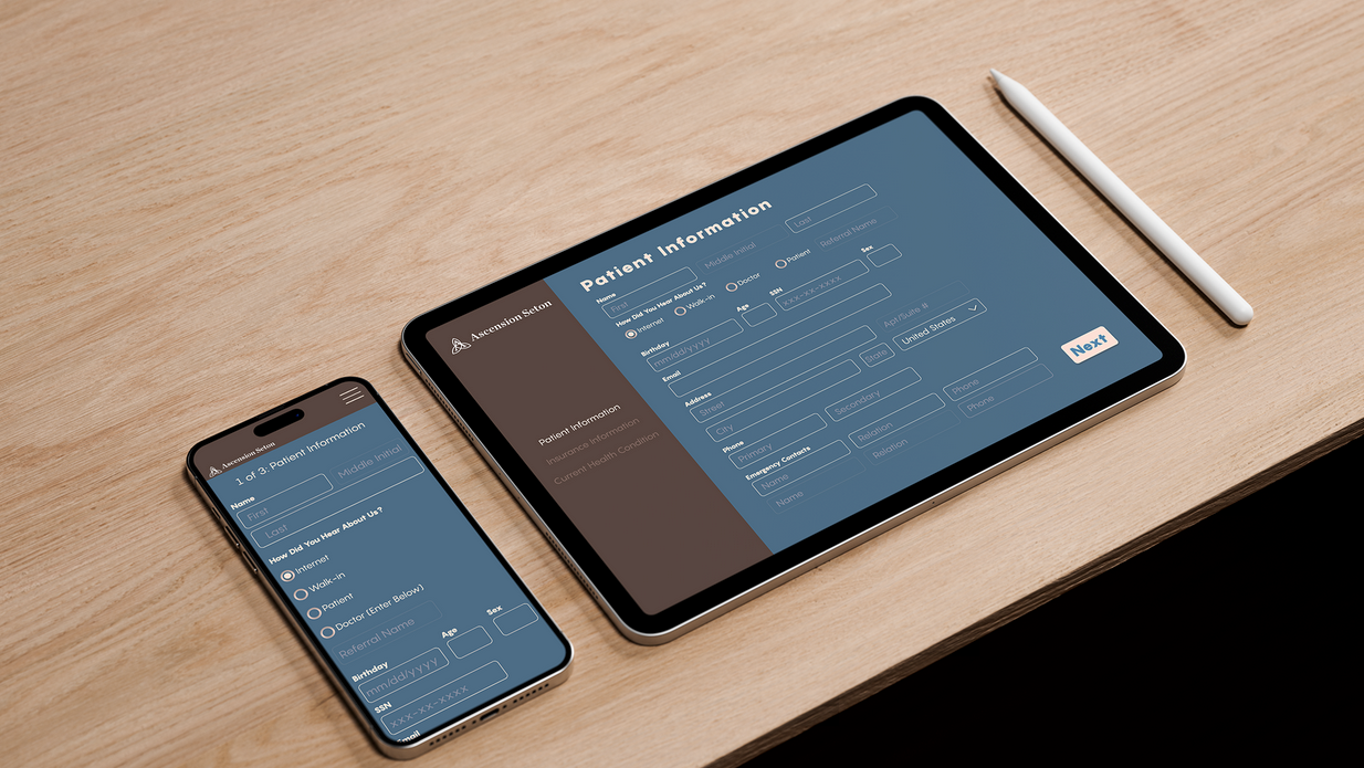
Preview of Final Screens:
Final Prototype:
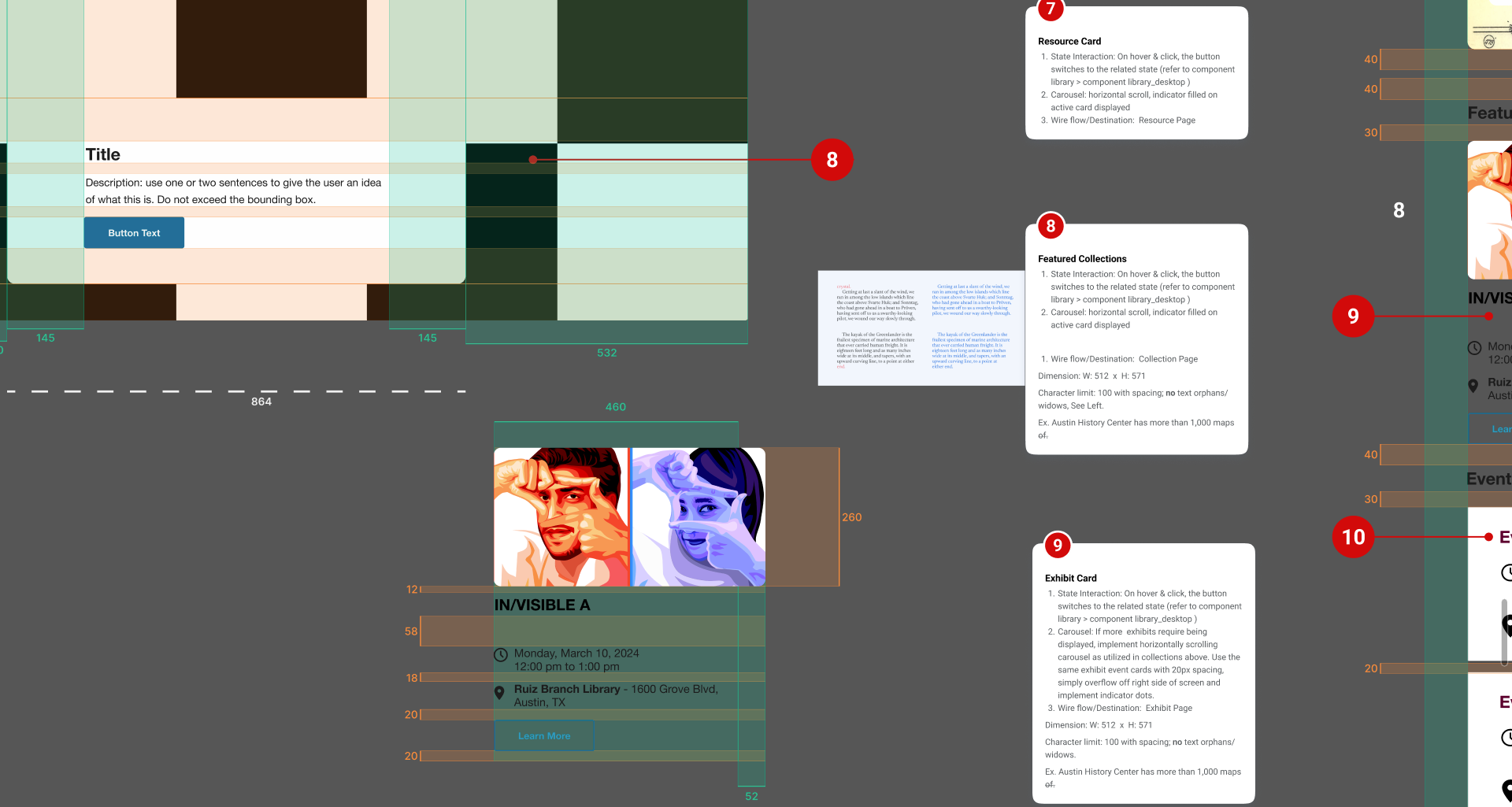
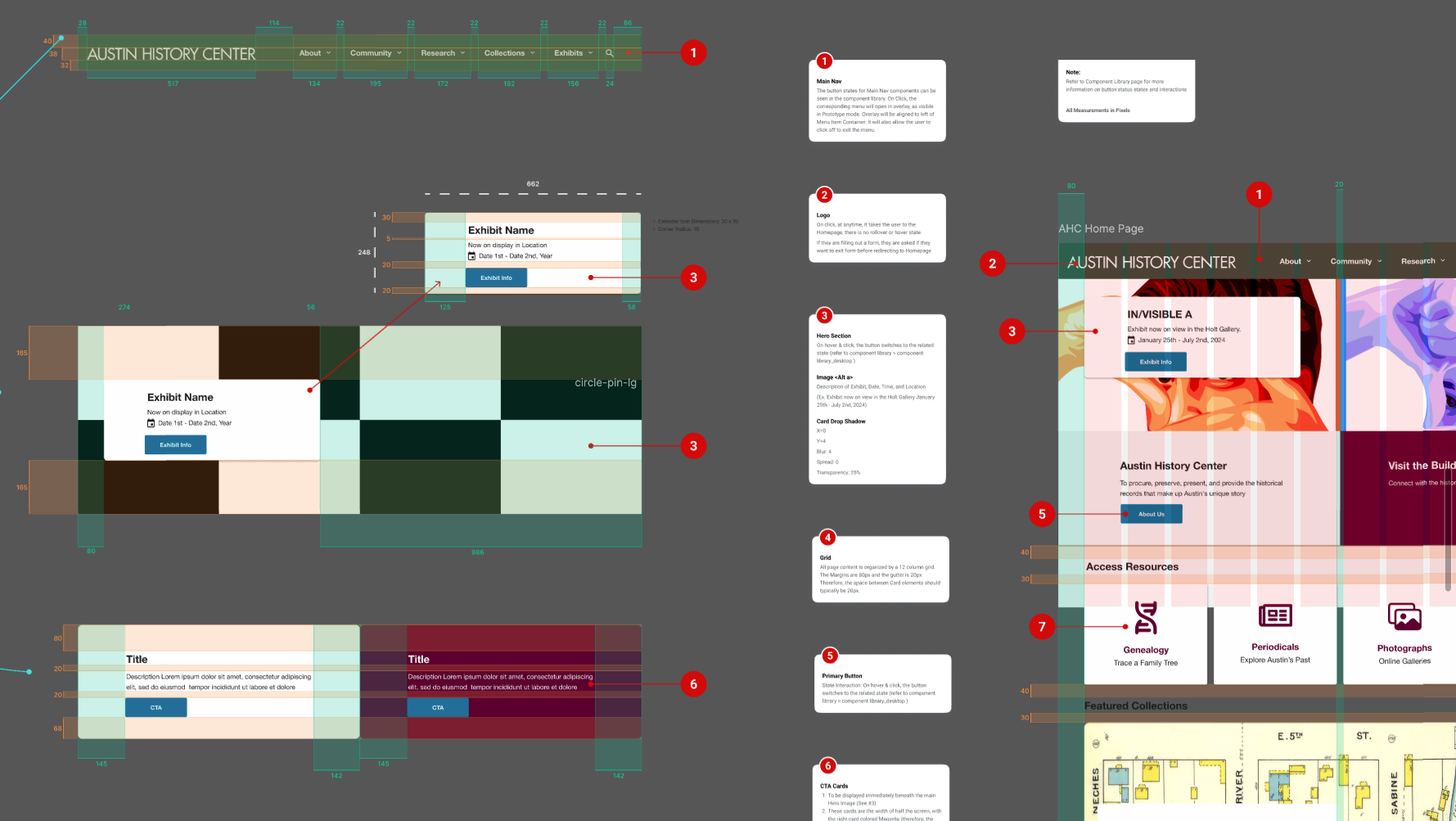
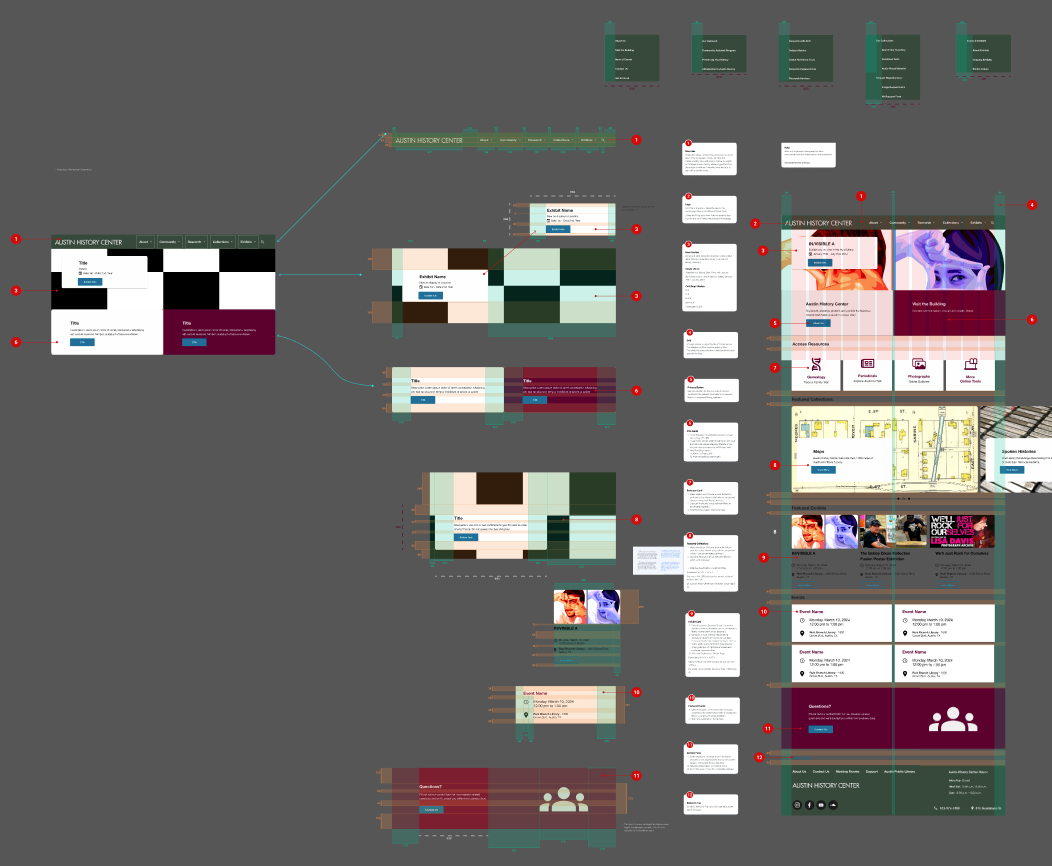
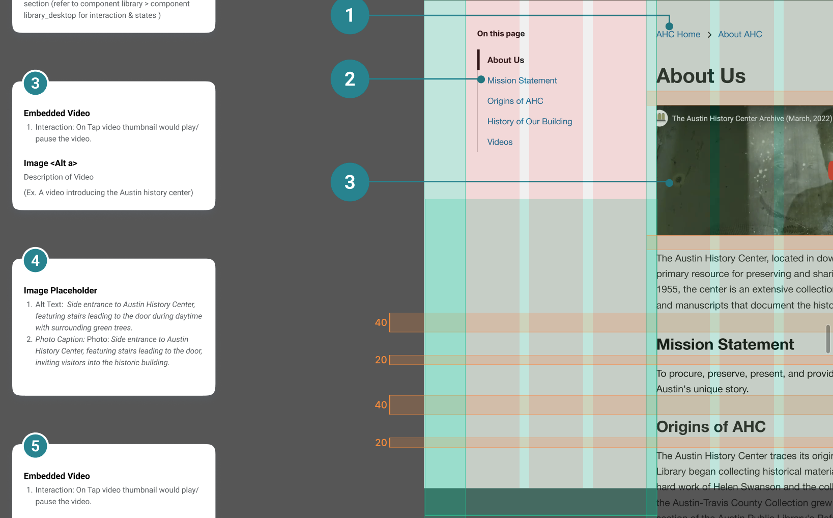
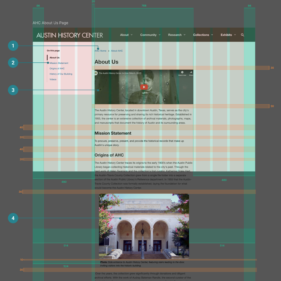
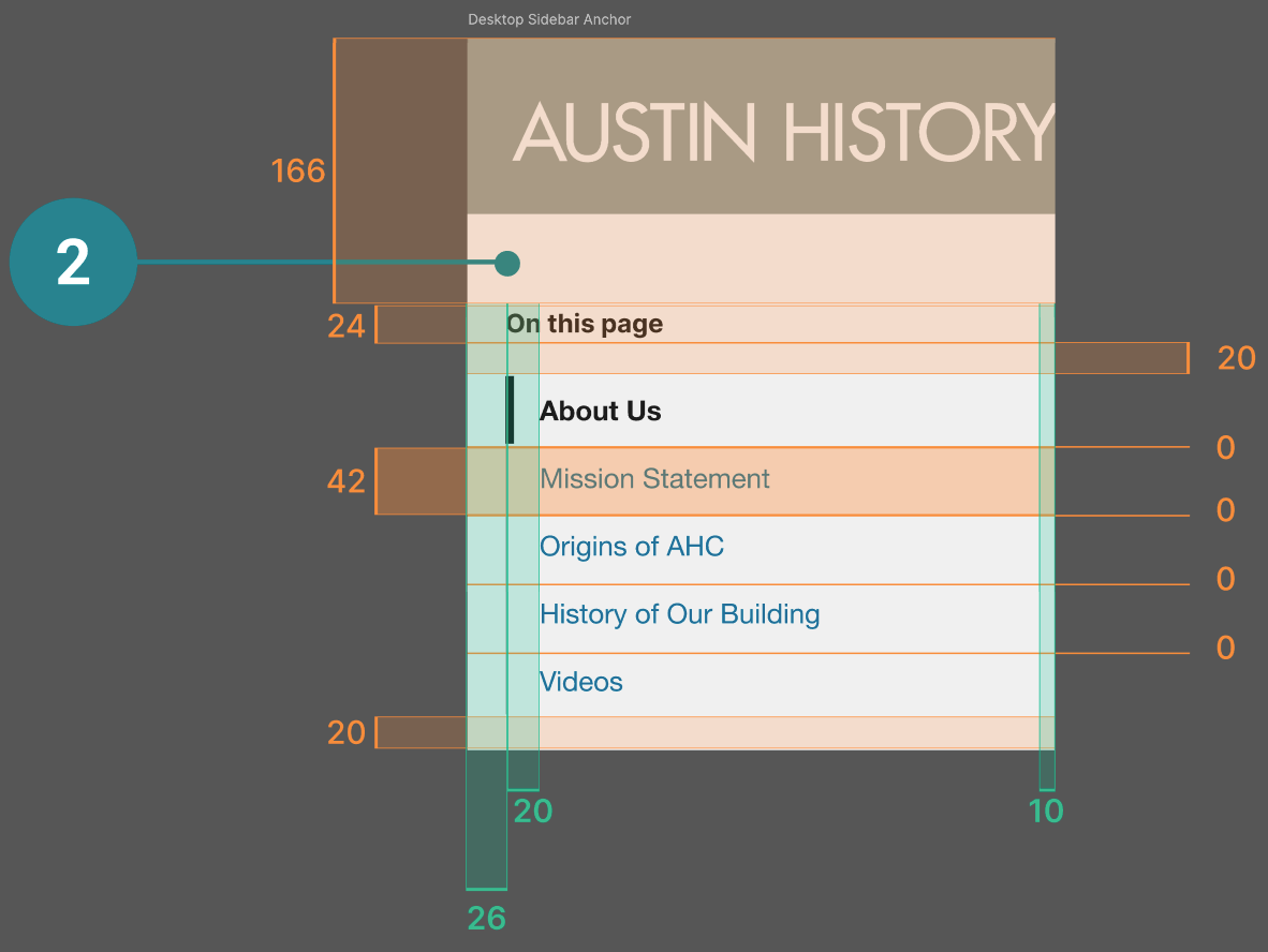
Preview of the Final Annotations for Hand-Off:



As the local history division of the Austin Public Library, the Austin History Center provides the public with information about the history, current events, and activities of Austin and Travis County.
The History Center collects and preserves information about local governments, businesses, residents, institutions, and neighborhoods so that generations to come will have access to this history.
When our team of four first met with the client, they communicated to us that they had hired a class of Information Architecture students from UT approximately 6 months earlier. While they had not looked at or implemented ANY of the work done by these teams, they passed it on to us in case we thought it would be helpful.
What they were looking for from our team was mainly an updated, responsive, homepage.
They gave us suggestions of what would be important, stating that the Exhibits, Events, and other “general information” should be featured. Something the client mentioned in our first meeting that stood out to me was the concept of a “front door,” an concept that I made sure to allow inform my process.
Stressing the importance of accessibility, they hoped to make the user feel “welcomed in.”
Acknowledged that their current site did not evoke that feeling, the History Center staff noted that in person, there is a human being at the desk to answer questions or direct you where needed. They stated that if we could have the homepage reflect this, that would be "amazing."
The Client also informed us that they had already separated their users into two groups: The Dedicated Researcher and the Layperson.
The Layperson, or “new user,” was described as “the person who is just curious enough to walk in.” They stressed that they would like this user group to be our focus.
They informed us that success in this project would be measured by minimizing “clickoffs.”
They want a new user to visit the homepage, visit a secondary page, and linger for a bit. In order to do this, we were asked to craft a more engaging experience for their users.
The biggest thing that stuck out to me after the first meeting with the client was the scope of work and the fact that they only wanted us to work on the Home page. After familiarizing myself with the current site , I advocated that just redesigning the homepage was not enough.
I advocated that these two additional pages not only hold key information for our users but also are most directly aligned with client goals of new user retention on secondary pages.
After discussing it with my team, we decided to add the About Us and Visit Us pages as well.
The first issue that came up for our team was whether or not to use the information architecture work given to us by the client.
Three teams from UT had each come up with a proposed sitemap for the History Center, performing multiple card sort tests and iterations each.
In order to be able to understand what we’d been given, we divided the work from UT amongst ourselves to attempt to digest it. I had a lot of fun with this as I hadn’t had the opportunity to look at another teams work at this depth before, however the majority of my team felt overwhelmed.
We decided that if the History Center had not used any of the previous teams’ work yet, that communicated its value to them.
With this settled, we moved on to other forms of research.
I performed a Heuristic Analysis while my team researched Industry Peers.
I identified key issues that were echoed by users in our Interviews which followed, such as the use of jargon in the navigation as well as poor text chunking and "scanability."
One of my teammates informed me that my heuristic analysis was very helpful for his understanding of the project when we were starting out.
Next were the Interviews. We pulled key insights from our interviews and created an insight map. I spearheaded the insight grouping since I LOVE sticky notes and grouping similarities. This allowed us to find trends in our interviews.
The highest priority items that were identified were: Navigational Jargon, Requested resources, the Sparse Homepage, and Issues finding Assistance.
I then presented these findings to the client during our meeting that week. It was my first time leading a client meeting like this and unfortunately I forgot to include questions to ask them after I presented.
Thankfully my team stepped in to support and I learned a lesson.
I then presented these findings to the client during our meeting that week. It was my first time leading a client meeting like this and unfortunately I forgot to include questions to ask them after I presented.
Thankfully my team stepped in to support and I learned a lesson.
Based on user and client goals, I created a new user flow to help us identify potential pain points. I do wish that I had also done a user flow of the current site state, but the biggest thing this process helped me with was focusing in on the project goals and the users point of view.
At this point in the project we decided to refine our problem statement:
We had a group sketch session to explore various ideas. An idea that I came up with was the inclusion of a generalized “get help” section, something we ended up including in the final designs, as you’ll notice in the maroon card. I also attempted to convey that “welcoming in” feeling the client was looking for.
Following our sketch session, my team had a discussion.
Something we had all noticed was difficulty the users had with the terminology used in the current labeling on the main navigation.
While three of us initially had a gut feeling to change it due to some quotes brought to light in the user interviews, our fourth team member brought to our attention the need for a REASON behind what we changed it to.
Although we were all in agreement that a change could be made to the navigation, this team member pointed out that we lacked evidence to know what the change should be.
Having settled this for now, we moved on to wireframing.
I drafted the lofi mobile designs and began to establish a type system to work with as well establishing padding, margins, and text box sizes.
As a team, we decided we liked my mobile wireframes and decided to follow a "mobile first" approach.
Below, you can see the influence of my initial mobile wireframes on the final designs done by my teammate.
Note the similarities in image placement and text chunking as well as utilizing cards for the commonly requested resources.
A Team Member needed help with synthesizing results from the first round of usability testing. I volunteered to help and analyzed 2 different user videos from tests she had conducted.
This helped us complete this task on time.
Following the first round of Testing, the issue of navigation and labeling came up again and we revisited this during a team meeting. I was irritated that we kept coming back to something I thought 1that we had already decided on.
I became frustrated and withdrawn, and my team noticed. I found myself pulling back from communication with them over this across the coming week.
I talked with my friends and people close to me and I realized that I had gotten stuck on something trivial.
Having to revisit a decision is an inevitability that often comes up when groups of people make decisions together.
My team and I conducted a “Pre-Mortem” to help make sure we were all on the same page as well as to plan for any eventualities that could cause us to fall behind.
Luckily, the effort I had put into synthesizing the Information Architecture work earlier in the project came into play here and helped make it easier for our team member to decide which groups site map to implement.
Revisiting the Information Architecture work given to us by the client allowed us to have a justifiable change to the terminology used for navigation, a change we were aware needed to be made due to our usability testing, research, and interviews.
With one round of testing left, we knew the navigational changes needed to be tested.
Again, to speed up the process, I volunteered to synthesize insights from two more user tests. It was nice to see the direct impact of decisions I made for my desktop designs and the ease or difficulty that this gave the users. The tests went smoothly and validated our changes to the navigation.
It became evident, however, that there was a continuity issue when comparing the test results.
Having tested for different tasks each time we lacked a baseline for comparison and quantifiable improvement.
I also realized that my desire to have input in how things were done compromised the continuity of our testing. My personal desire to process the second round of tests a certain way added a second layer of inconsistency to our testing.
That’s not to say the testing wasn’t helpful, it just could’ve been more consistent. However we presented our findings to the client and they gave us their feedback.
You can see below the list of final changes to implement.
On the day this list was made, my child was causing a ruckus and as such I had to leave the meeting early. I felt very frustrated and embarrassed, but my team was supportive and understanding.
My teammates knew they could depend on me to implement the various changes they had agreed on.
It now felt good to be able to implement changes decided on by others, who I had grown to trust and feel open to asking questions of. This stands to me in stark relief compared to the anxiety I had earlier in the semester concerning the possibility of not being involved in a decision being made.
It now felt good to be able to implement changes decided on by others, who I had grown to trust and feel open to asking questions of. This stands to me in stark relief compared to the anxiety I had earlier in the semester concerning the possibility of not being involved in a decision being made.
And here are my finalized desktop screens. As I looked at the designs I had created, I felt grateful for my team and the collaborative effort the prototypes demonstrated. I could see my influence in their designs, and they could doubtless see their influence in mine.
We presented our designs to the client. All the representatives of the Public Library and History Center gave us positive feedback, only having a few concerns about corner rounding and card sizes.
I was aware at this point that these were more than just screens, that hopefully this would allow many more people to use the resources that the Austin History Center has to offer.
Since there was a set time frame for this project, I knew we would likely not be available for the developer who would be implementing our designs. Therefore our team coordinated with him to ensure all information was coherent and explained.
I enjoyed this part of the project a lot and would love to do it again. The full annotations are available in the Figma link at the top of this page.

I would like to conclude this case study by reflecting on the impact it had on me and what I've learned.
As a person, I grew more understanding. I learned to use my voice, and I learned when not to use my voice.
Through long discussions with my teammates and getting to know them and learn from how they problem solve, I learned I don’t need to have an opinion on everything.
Through long discussions with my teammates and getting to know them and learn from how they problem solve, I learned I don’t need to have an opinion on everything.
Realizing my desire to be heard and to have input in discussions led me to see that I owe other human beings the right to be heard.
As a teammate, I learned how to ask questions and give feedback in a manner to better promote a discussion.
I realized that curiosity and a desire to understand are traits I hold deeply and I learned to appreciate these things in myself and in others.
I learned to communicate my thoughts and feelings to relative strangers, and I learned how quickly, with the right attitude, people can change from strangers to teammates.
I took this class because I wanted the opportunity to work for a real client doing real UX work before i graduated. As a Visual Design student, I knew that I both needed and wanted to grow in this area. Over the course of this project, I learned to trust the process and remember that I have something to learn from everyone.
Being able to help create a welcoming experience for users of public resources was fulfilling and inspiring, and being told that our work will be “instrumental going forward” was very encouraging.
I’d like to thank my teammates, who have helped support me through social anxiety and who taught me many things throughout this project.
I’d also like to thank the supportive and appreciative staff from the Austin History Center and the Public Library, who listened to what we had to say and kept us on track.
I’d like to thank my partner who helped out with kiddo and put up with my stress and irritability at times during this project.
And I’d like to thank my Professor who encouraged me to open up and reflect in a way no professor had for me before.
