In 2020 I was a student at Austin Community College.
My studio class was tasked with developing the identity for The Art Galleries at ACC Highland (A clunky name, but one they stuck with). The identity would be used for each building's gallery (bldg 4000,2000, and online).
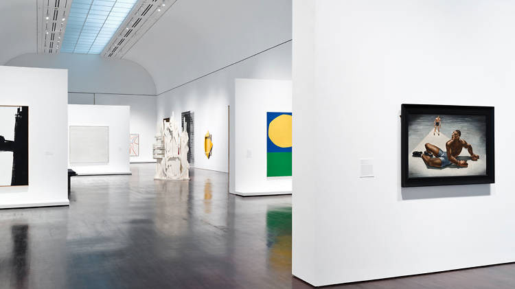
The gallery was created with the desire to showcase past and current ACC student work. As such, we wanted the focus to be on the ART rather than the BRAND.
My Team
- Zoe Axelrod
- Austin Sears
- Nathaniel Chalk (Me)
Research






Exploration






The Art Galleries at Highland logo is designed to be modular in order to successfully incorporate and consistently bring brand identity to each of the three locations. When being used to represent the organization as a whole, the primary logos will suffice. However, when a specific location is being referenced or represented, the correct logo will need to be used.
Final
The logo is the most recognizable
component of the
visual identity. It most commonly
and uniquely identifies that
brand.
component of the
visual identity. It most commonly
and uniquely identifies that
brand.
For The Art Galleries at
Highland, creating a distinctive
and cohesive brand is key to
standing out in the community
as a recognizable
brand. We decided on an abbreviation that was a one syllable word, easy to say and remember.
Highland, creating a distinctive
and cohesive brand is key to
standing out in the community
as a recognizable
brand. We decided on an abbreviation that was a one syllable word, easy to say and remember.
The colors are shades of primary colors, referencing education, and the overlapping color mixing speaks to creativity and new things coming from the school. This is perfect for a gallery showcasing student work.
Today the TAG Identity is used in person and on web for the ACC network.
